

 My kid Max likes to draw. Seeing as how it doesn’t require a TV or mobile device or Wii remote, I encourage him to draw his little fingers off.
Lately, my husband and I have been the beneficiaries of his creative outpouring. He spends Saturday mornings contemplating his next works of art and comes home from kindergarten with a backpack stuffed full of paper treasures. (I don’t mean this to sound like some idyllic piece of motherhood; he also spends a lot of time in serious misbehavior mode.)
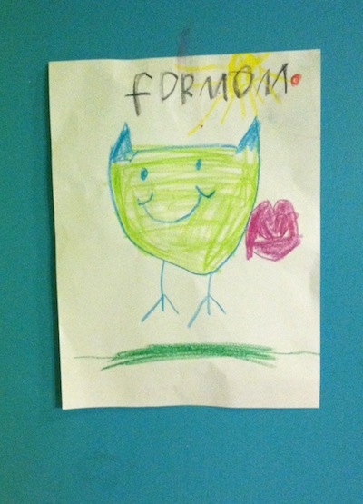
The other day, he sat at his little art table and asked me a series of questions. What animal do I like a lot? An owl, I answered. Then he asked what was my first favorite color. Aqua, of course! How about my second favorite color? Green, I said. Third favorite color? (5-year olds are really into prioritizing favorite colors.) I thought for a minute and said pink. Follow up question: Dark pink or light pink? Something in between, I said. What about my favorite shape? A heart, I told him.
A few minutes later, he proudly presented me with the drawing here, full of all of my favorite things. “It even has the sun, because I know you like the sun,” he said. I hung it up in my office. I’m looking at it right now as I write this. It’s adorable and precious and lovely as pie.
But please, please, please, don’t build your brand like this.
 What You Love Vs. What You Need
There are ways in which your brand is akin to the song “My Favorite Things.”
But mostly, it’s not.
Let me explain.
There is this thing I notice that happens with solopreneurs and small business owners (who sometimes become larger business owners). They start their branding process by thinking about what they like and what appeals to them. This makes perfect sense. How else would you start? It’s your business. That’s some good raw material.
But then, a tricky maneuver has to happen. You have to make a focused calculation that blends the reason you’re in the business with a visual and verbal representation that will speak to your target people (clients, customers, members, supporters). You have to move out of the plane of simply what you like or what has personal meaning to you and into the plane of what best represents your business to the world. Depending on your personality and level of focus, this can be a fairly large move or an itty-bitty rethinking.
So, I like fancy frosted cupcakes and retro girly swirly fonts and Endless Summer hydrangeas and Charley Harper prints and really long Harry Chapin songs and vintage linens from flea markets. These things say a lot about me. And because I am me and when you hire me, you are, in fact, hiring ALL of me (whether you know it or not), these things matter.
But they are not my brand. There may be elements and little parts that work their way in. But they are not the representation of me that will resonate and attract the kind of work I want.
People get stuck at that focused calculation step. It’s how they wind up with logos that have all kinds of personal meaning but don’t clearly communicate anything. I worked briefly with a small business owner that was so married to the personal meaning behind her logo that she couldn’t see that the world didn’t get it—and if anything, it was potentially turning people off. It’s not that they wouldn’t have resonated with her story. It’s that she wasn’t communicating it effectively. It’s easy to see this disconnect visually. But I see it with the words people attach to their brand as well: the taglines, the phrases, even ideas about the amount of words. People often say things like: “I don’t like too many words.” I get that. But how about if we forget that and just focus on the right amount of words to tell your story, so your people understand it?
The bottom line is that when you work with someone to build your brand, beware if the conversation doesn’t move away from: “So, uh, what do you like?” The conversation can start there for sure. There are things to be mined. For example, I adore aqua something ferocious. It happens to look good on me and it makes me happy. But more than that, it represents fluidity and calmness and connectedness to me—as well as to lots of people in the world. So it makes sense that my designer chose it as my brand color. The reasons overlap.
But that’s often not the case. Your designer and copywriter need to be able to mine what you love and ultimately pull out what you need.
This is my problem with those design-for-hire and copy-for-hire sites like Elance. Talent definitely lurks around those sites, even if it is about the lowest bidder. But the writers and designers aren’t the problem. The problem is that the client is far too in control. It’s hard to build a relationship that way and get beyond the eager: sure, I’ll design or write whatever you like for $100! The thing is (and I’m sorry to be so blunt), there’s a pretty good chance what you like is irrelevant and you don’t even know what you’re looking for. But it’s awfully hard for the lowest bidder to be honest or truly helpful.
Surround yourself with your favorite things. Enjoy them. Share them. Let my kid draw a picture of them for you. But do some careful thinking before you decide to brand around them.