Of course, do all of this.
But then, get out of your head for a while. And just think about what you want your web site experience to feel like. The best way to do that is to stop thinking about web sites, and think about altogether different things.
Here are five things, to get you started.
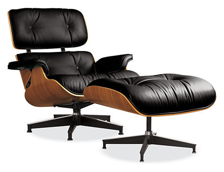
1.  An Eames Lounge Chair
I mean, it’s gorgeous.
But it’s 100 percent functional. It tells you what to do (sit down!), but in a remarkable, beautiful way. When Ray and Charles Eames designed this in the 1950s, it was a totally new approach to a chair. The way they bent the plywood: no one had ever done that before.
So, I think this chair is one of the coolest pieces on the planet, but I know that it doesn’t call to everyone. It looks the way it looks on purpose. You might think it’s ugly. It’s not for you then.
Ultimately, it still does the thing it was built to do: give you a place to sit down.
Your web site needs to do the thing it was built to do (be a web site), but it can be beautiful. And innovative. And it should definitely be a statement.
2.  Boarding a plane(when air travel was still glamorous, minus the problematic fetishizing  of female flight attendants)
Okay, boarding a plane now is a little piece of terrible. So let’s go back to a more sophisticated time in the history of air travel. When boarding a plane was a luxury. You were welcomed onboard. Perhaps with a drink. You sat down, and got comfortable.
Your needs mattered, and all around you, there was evidence that your needs mattered.
Your web site can have one of any number of personalities, from chic to cozy to futuristic. But it should always welcome people, lead through them, help them get seated, and reaffirm that they are in the right place.
3.  A thesis statement
Remember when you had to write papers in high school or college? Remember how you were always supposed to start with a thesis statement?
It turns out, thesis statements sort of rock. Because they make you stay focused and be specific. And (when you write them correctly), they make you take a stand. A thesis statement represents your view. And then everything else you talk about (“the evidence”) just reinforces it.
Your web site is like a thesis statement in that it takes some sort of stand. It represents your brand and your vision for how life should be. And all of your content just reinforces it.
4.  A really good movie
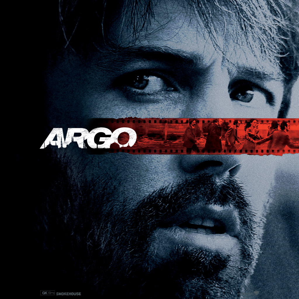
We need an example, so let’s just say Argo, because it’s the best movie I’ve seen recently. And it just won the big award.
So, Argo. It’s a story. It’s got characters with dimension people identify with. It’s a snapshot of something. And you want to keep watching it. Of course, there is some fancy Hollywood storytelling, because it’s important to paint a picture (the same way good copy and strong design do). But there is something very true at the heart. It’s about something. You can summarize it: Oh, it’s about the Iran hostage situation from the 80s, and how they got out the six hostages who escaped the embassy at the last minute.
Your web site is a story that’s about something, too. Something that people can summarize quickly. And hopefully, something they want to keep watching).
5.  A sewing pattern
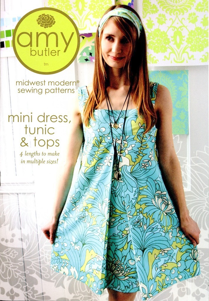
Even if you’ve never sewn a stitch, you’ve probably seen a sewing pattern (this is a beautiful one by the lovely and talented Amy Butler; you can find it here!). Here is the thing about a pattern: it shows you the thing you want. It shows you what you’re going for. So, it’s got an aspirational quality.
But it’s also full of help to get you there. It just doesn’t show you something and then tease you. It works for you, and tells you the exact steps you need to follow to make the thing.
A web site can be highly aspirational. Lofty—sure. Bring it on. But it shouldn’t promise anything it can’t deliver.
So, what things come to your mind when you think about a great web site?


